The Psychology of Color in Interior Architecture
Color is often the first element perceived in a space. Before materials, before form, the eye registers tone and atmosphere.
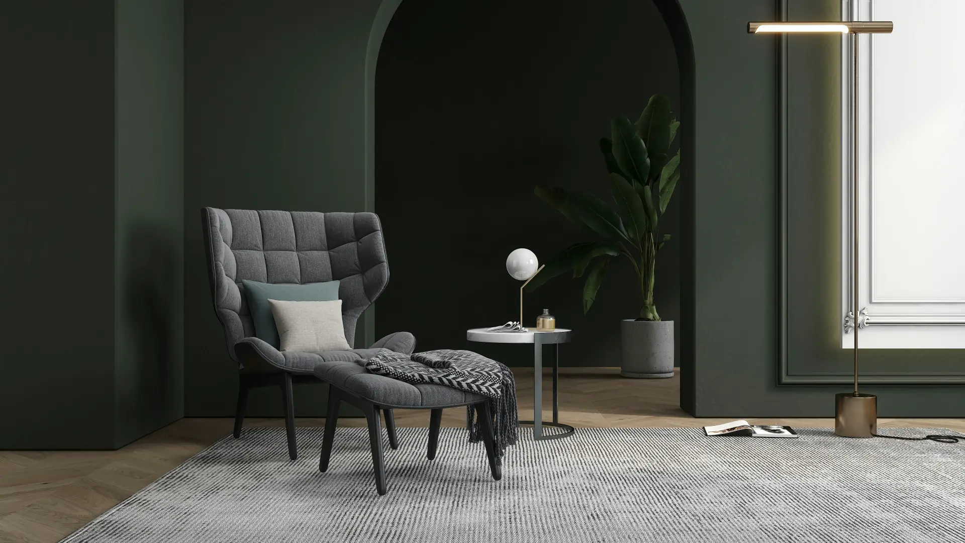
In interior architecture, color is not decorative—it is structural. It shapes perception, influences behavior, and defines the experience of a space.
Color and Spatial Perception
Interior architects use color to subtly alter how a space is perceived.
Warm tones—such as terracotta or ochre—tend to advance visually, creating a sense of intimacy in larger volumes. Cooler tones, such as soft blues or greens, recede and can make a space feel more open and expansive.
Color and Well-Being
Beyond perception, color has measurable psychological effects.
Muted, natural tones can create calm and stability, making them well-suited to private spaces such as bedrooms. More saturated tones can encourage focus or interaction, depending on their intensity and context.
Light, Material, and Context
Color does not exist independently. Its impact is shaped by light, orientation, and material.
A shade that feels warm in direct sunlight may appear neutral—or even cool—in a different setting. Similarly, texture alters perception: a matte surface diffuses light, while a reflective finish amplifies it.
A Balanced Approach
Selecting a color palette requires considering:
- The function of the space
- The quality of natural light
- The relationship between materials
- The overall architectural intent
Adapting color to light
A color is never perceived on its own. It changes with the orientation of the room, the size of the openings, artificial lighting and the surrounding materials. A beige can become cold in a low-light space, while a deep green may feel elegant or too heavy depending on the surface it covers.
Before defining a palette, INTERIO studies natural light, room function and the desired feeling. In a bedroom, the goal may be calm. In a professional space, the objective may be to create a stronger identity without making the atmosphere visually tiring.
Building a coherent palette
A successful palette often works on three levels: a dominant base, a secondary shade and an accent. The base structures the space, the secondary shade adds depth and the accent brings character. This method avoids a collection of unrelated colors.
Materials also play an important role. Wood, stone, metal, textile and glass all change how tones are perceived. A color on a wall does not create the same effect as the same color on a sofa, curtain or decorative object.
The common mistake to avoid
The most common mistake is choosing a color only because it is trendy. A shade should first serve the project: visually enlarge, warm up, calm down, structure or highlight an architectural element. When it responds to a clear intention, it remains relevant for longer.
- Test colors at different times of the day.
- Limit the number of strong shades in one room.
- Connect colors, textures and lighting from the design stage.
- Plan coherent transitions between rooms.
Conclusion
In thoughtful interior architecture, color becomes a tool for shaping atmosphere as much as form.
When carefully considered, it contributes not only to how a space looks—but to how it feels to inhabit.